Front-end developers are constantly pushing boundaries with experimental APIs, creative data visualizations, and hardware-specific optimizations. The latest round of explorations includes a breakthrough for rendering HTML inside canvas elements, a hexagonal map for analytics, a fully functional web-based OS for e-ink readers, and a clever CSS trick to swap image sources. These innovations highlight the versatility of modern web technologies and the ingenuity of the developer community.
Rendering HTML Inside Canvas: A New Frontier
One of the most talked-about developments is the HTML-in-Canvas API, which allows developers to render real, semantic HTML within a <canvas> element while applying visual effects. This capability was demonstrated by Amit Sheen, who created a collection of interactive examples at the HiC Showroom. The demos, such as this one (requires Chrome 146 with the chrome://flags/#canvas-draw-element flag enabled), showcase how standard web content can be seamlessly integrated into a canvas environment, opening doors for enhanced graphics, transitions, and compositing without sacrificing accessibility or structure.
Hexagonal World Map Analytics: A Design Retrospective
In a fascinating retrospective, Ben Schwarz (coincidentally sharing our editor’s surname) shared his experience building a hexagonal world map analytics feature. The article, published on the Calibre blog, steps through the entire journey—starting with design constraints and inspiration, moving through engineering challenges, and culminating in the use of SVG and CSS to produce an elegant, data-dense visualization. Although not a developer tutorial, the post offers valuable lessons in balancing aesthetics with performance, and how hexagonal grids can reveal patterns that rectangular maps might hide.
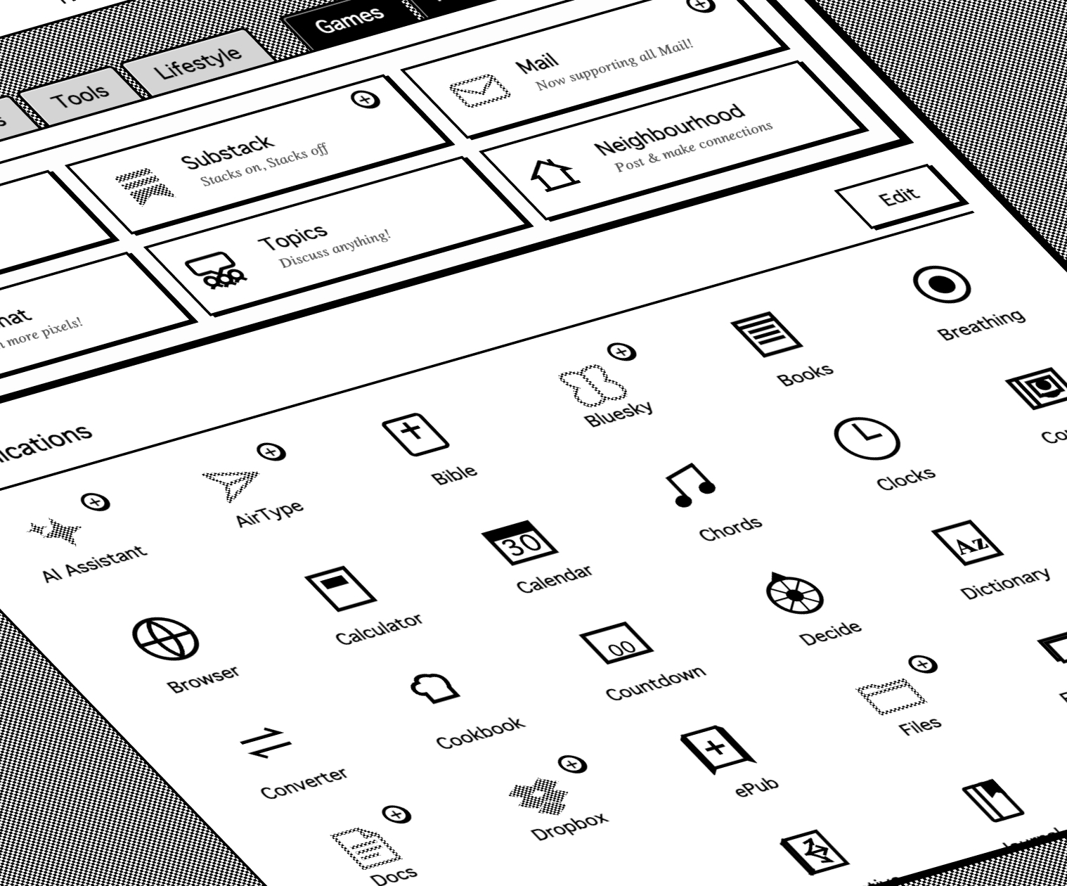
Rekindle: A Web-Based OS for E-Ink Devices
The Rekindle project takes a different approach to low-power hardware: it’s a complete web-based operating system designed specifically for e-ink devices like Kindle, Kobo, and Boox. Typically these devices run proprietary, stripped-down browsers, but Rekindle delivers a rich app experience using only black-and-white rendering, no animations, and other e-ink optimizations. The underlying technology relies heavily on Media Queries Level 5, which can query capabilities such as hover support, pointer precision, display update frequency, color depth, and more. However, the challenge remains that many e-ink browsers do not yet recognize these queries. As the specification and browser support evolve, we may see broader adoption of e-ink-friendly media queries. For now, dedicated platforms like Rekindle fill the gap, but a deeper technical dive from its creators would be most welcome.

Replacing Image Sources with CSS Content Property
A surprising trick was shared by Jon, who discovered that the CSS content property can be used to change an image’s source. For example:
img {
  content: url(new-image.png) / "New alt text";
}
This works across all modern browsers, and the content property has been at Baseline for over a decade. Even more intriguing, this technique also works with the image-set() function for responsive resolution switching. While not immediately obvious, this capability allows developers to override image sources entirely from the stylesheet—useful for theming, accessibility, or dynamic content changes without JavaScript. It’s a reminder that even well-established CSS properties still hide untapped potential.
These four experiments represent just a snapshot of the creative energy in web development today. From canvas rendering to e-ink optimization, each project pushes the envelope in its own way. Keep an eye on these spaces—they might well influence the tools and techniques we use tomorrow.